7 Things I notice in the first few minutes of seeing your site
One thing I’ve noticed from working with website clients over the years is that the things they hem and haw over, rework, and contemplate the longest are often completely different from the things I’m looking at. When I get on a consult call with a client and point these things out, they’re usually surprised—it’s often not something they’ve even considered!
So today, I’m giving you a little freebie. If you’ve ever wondered what a professional web designer notices and looks for first when they land on your website, this is it. And it might surprise you: it’s usually not your perfect headshot or your font choices.
When I open a client’s website for the first time, I’m looking for one thing: Can I, as your potential customer, quickly understand what this business does—and how to get in touch or take the next step?
That’s it. Before I worry about the fonts, colors, photos, or whether I love the design, I want to know: Am I in the right place, and what am I supposed to do next?
1. Can I tell what your business does within 10 seconds?
When I land on your home page, I ask myself: What does this business do? (Aka am I in the right place?)If I have to dig and scroll before I figure it out... that’s a problem and we have work to do.
Your homepage should immediately answer:
What does this business do (or what do they offer)?
Who is it for?
Usually, the work is primarily done by your H1. Writing a strong and specific H1 headline—not something generic like "Welcome" or "Helping You Thrive" goes a long way toward navigating your visitors immediately.
Instead of "Welcome" or "Helping You Thrive," we want to be specific:
Powerful Keynote Speaking for Women Embracing Middle Age
Commercial Plumbing for New Construction
Virtual Appointment Pediatric Therapy in Portland
If users don’t have a clear understanding that they are in the right place right away — you will lose them. They’ll head back to Google to try again. So this H1 is key.
2. Are your buttons (and CTA’s) helpful?
This is one I notice a lot on DIY Websites - especially given that Squarespace templates are meant to be vague and that’s where a lot of DIY’ers start.
Buttons that say “Learn More” or “Click here” don’t actually tell me anything!
Instead, make your buttons match the action. Try buttons like:
Schedule a Consultation
View Pricing
Browse Our Classes
These buttons give your visitors confidence because they know exactly what will happen when they click.
Very important as well: They're also more accessible. Imagine you're using a screen reader or have low vision. If every button on a page says "Learn More," how are you supposed to know which one leads to pricing, which one goes to your services, and which one takes you to your contact page?
The more descriptive your buttons are, the easier your website is to navigate—for everyone regardless of their access needs.
(If you need help making your site more accessible, there are a lot of tips and tricks I can help you with - feel free to contact me!)
3. Does It look good on mobile?
As we all know, we live in Phonetown USA these days. More than half your visitors are probably on their phones but you most likely had your site built on a desktop. One of the hardest things for designers to get right (especially in Squarespace!) is getting the spacing right across different sized devices and screens.
Things I look for right away are things like:
Is the logo legible?
Are headlines wrapping weirdly?
Is there a bunch of random space? (Especially in footers and banner sections)
Are text and buttons evenly spaced out?
A beautiful desktop site doesn't matter if the mobile version is frustrating to the user.
4. Is it obvious how to contact you?
My biggest pet peeve on any and all websites is being unable to find a contact page. It should be super easy to find how to contact the business… usually in the footer but also in the navigation itself.
Overall, it’s frustrating for users when they can’t find what they are looking for. If they have to hunt things down, you’ve lost them. They will go back to Google. The world has a short attention span! Make it easy for them and they just may want to do business with you. :)
5. Does this website feel like a real business run by humans?
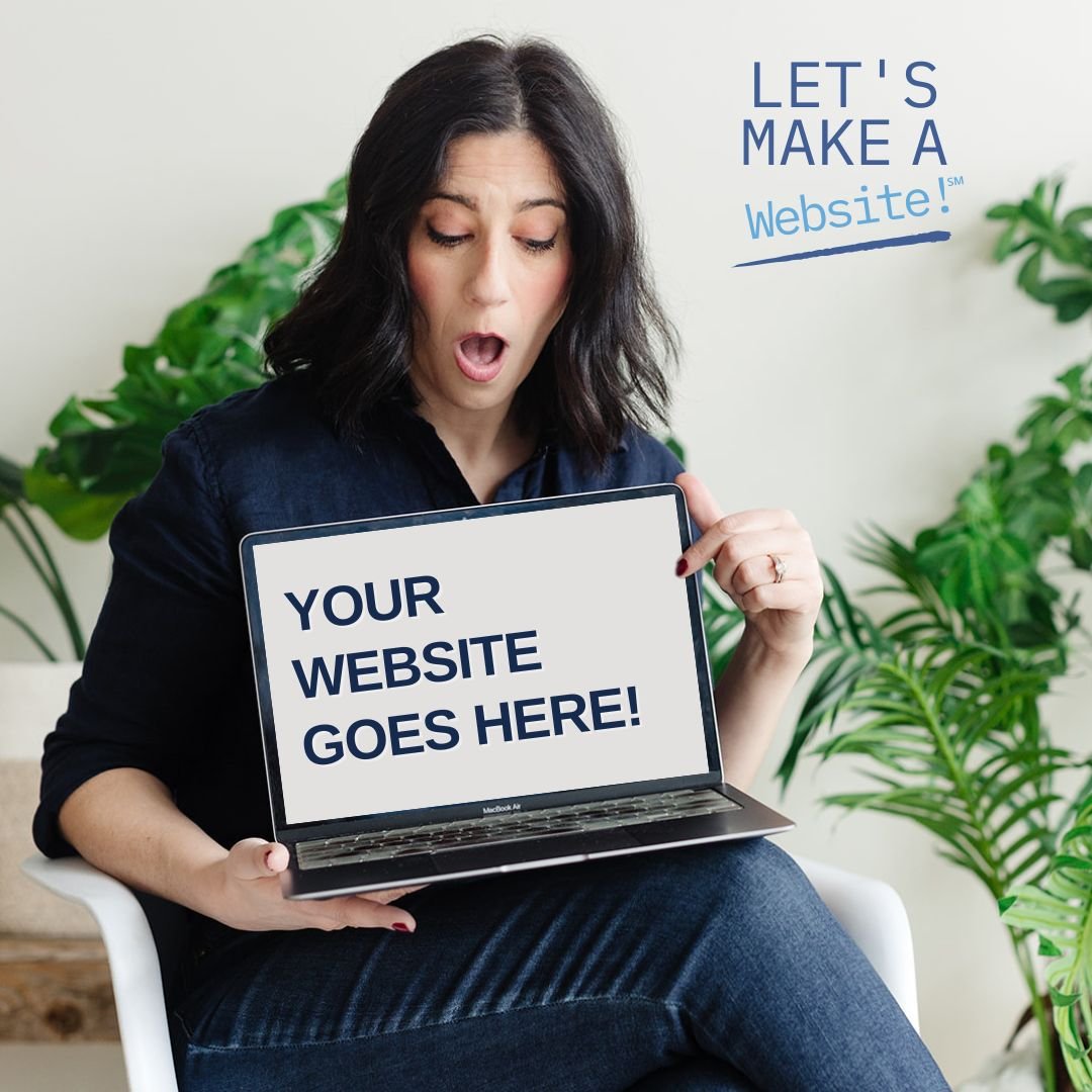
In 2026, this is something I think about a lot more than I used to. Years ago, it was usually pretty easy to spot a scam website. Today? Not so much. AI and bots have gotten so advanced that it can be hard to distinguish between legit and non-legit business websites. But for me — I want to work with real human beings. (Don’t you?)
So when I land on a website, I'm looking for signs that there are real humans behind the business.
Things like:
Real photos of the owner and team (not AI-generated images or obvious stock photography).
An About page that actually tells me something about the people behind the business.
A physical location, if applicable.
Testimonials that feel genuine and specific.
A clear way to get in touch with a real human person.
I also love seeing little details that only a human would include. Maybe it's a funny story about how the business got its name or a photo of the office dog. Maybe it's mentioning that you've served the Portland area for 20 years or that you started the business after leaving a corporate job. Those kinds of details build trust because they're authentic and well, human. They help potential clients feel like they're getting to know a real person—not just reading words generated by AI.
At the end of the day, people want to do business with people. The more your website reflects the humans behind your business, the easier it is to build trust.
6. Does the website look cared for?
This is one of those things visitors notice without realizing they're noticing it. A website doesn't have to be redesigned every year, but it should feel like someone is paying attention to it.
When I'm doing an audit, I look for little clues like:
Is the copyright year current?
Are there broken links?
Are there announcements or events from three years ago still on the home page?
Are there any placeholder images or "Lorem ipsum" text left behind? (I always notice Squarespace default text if someone used a template and didn’t personalize i!)
If there's a blog, has it been updated somewhat recently?
None of these things are huge deal on their own. But together, they send a message. A well-maintained website tells visitors, “This business is active, professional, and pays attention to details.” An outdated website can unintentionally communicate the opposite—even if the business itself is incredible.
The good news? Keeping your website fresh doesn't have to mean another full redesign. Sometimes it's just a matter of making small, thoughtful updates throughout the year. This is actually one of my favorite ways to work with clients. Whether you need an occasional hour of website help to knock out a website to-do list or ongoing monthly Squarespace support, I'm happy to be your website teammate! :)
7. What step happens next?
This is similar to the contact page but slightly different. Let’s say I do want to take the next step on your website — How do I do it? Should I book a consultation? Call or Email? Fill out a form? Join your email list?
Too many websites assume visitors will figure out the next step but it’s best to guide them. In fact, every page on the site should have a clear next step or “call to action.” (CTA)
Did you get this far? Nice work. Here is the good news:
Most of these aren't huge redesign projects.
They're small, strategic improvements that make your website easier to understand, easier to use, and ultimately better at turning visitors into customers. Because at the end of the day, that's what a great website should do. And I’m here to help!
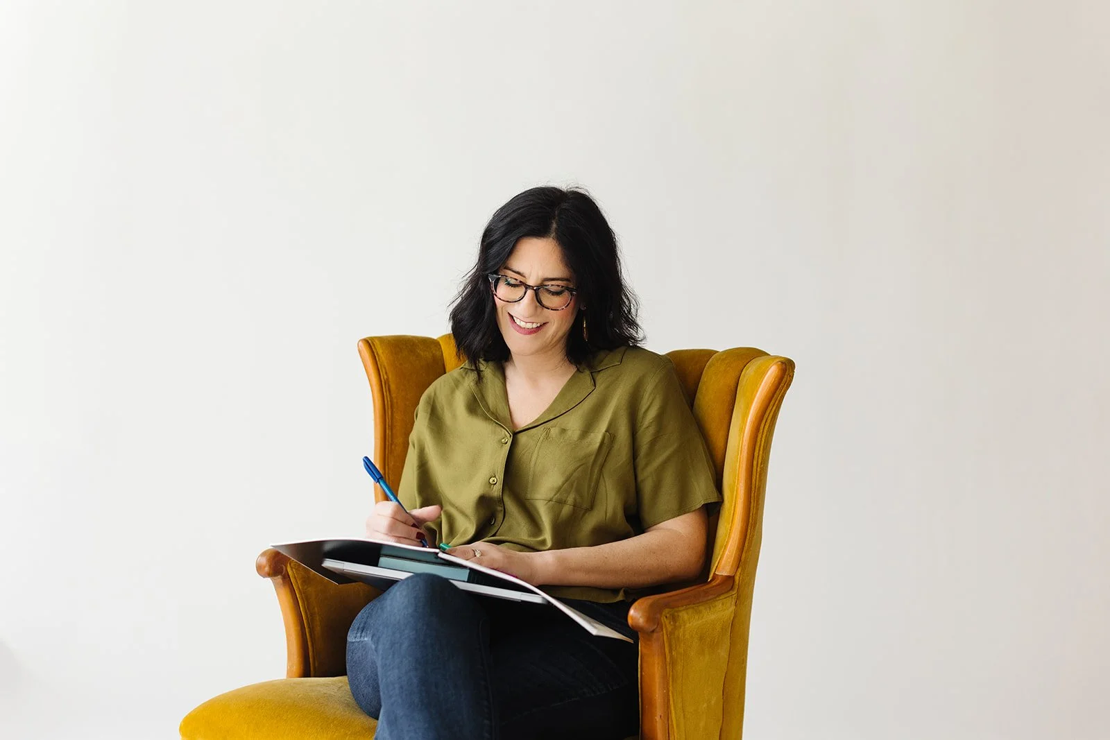
Hi I'm Rachel with Let's Make a Website®!
When you hire me as your web designer or updater, you're hiring a teammate! I want to strategize and collaborate with you to make your website the best online tool for your business. Let's work together!
You may also be interested in:


I help small businesses strategize and launch Squarespace websites that work for them!
View Website Services